Newsletter

The Official Publication of the Indian Institute of Interior Designers

Powered by Nippon Paint

The official publication of the Indian Institute of Interior Designers • Powered by Nippon Paint

Dr. Kaustav Sengputa
20 Oct 2023

Exploring the Impact of Colour

Colours
Trends
Inspiration
Click to Copy URL

Masterclass Series by Nippon Paint

“Colours impact spaces but can it impact humans?” is a common question. Hence, let me start this masterclass with it.

Colour is omnipresent in our life. However, most of the time colour impacts us subconsciously and hence remains unnoticed. A research article published by the University of Melbourne indicated that 89% of the time colours influence our major decisions.

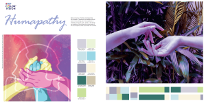
Yes! Colours can communicate in a way that our body and mind react to it. However, colours mostly communicate with us as colour stories (Images, memory, tags, stimuli) and colourways (a set of colours as story stimuli). For example, the colour theme of this volume of Inscape is Violet. In reality, Violet will never stand alone as a colour. This means, there can either be a Violet-White colourway or a Violet-Red colourway (or any other colour-ways) and both of these colourways can communicate or impact us differently. Violet is also part of various colour stories that can impact. In Nippon Paint ColorVision 20x21, Violet appeared under the colour story ‘Humapathy’ where we reflected empathy through colour-ways of powdered Violet and muted Violet with other “comfort colours”. Globally, the colour Violet is associated with flowers like Lavender to reflect calmness or hyacinth which represents sorrow, regret and forgiveness. It can symbolise regretfulness at things not said or troubling issues unresolved. However, the rich purple is depicted as the colour of luxury if teamed with Gold, Red or Blue.

Let us also accept that we are one of the weakest species on Earth when it comes to seeing colours. Humans only have three types of cones (photoreceptors), usually designated as L, M and S (long, medium and short wavelengths respectively), whereas the other species like butterflies have at least 15 sets of photoreceptors! We cannot see Gamma rays or Ultraviolet rays, nor can we see X-rays or microwaves. Hence, our visual capacity is limited. However, it is amazing to note that our species experiments with colours so much, with this limited vision!

Humapathy in Nippon Paint, Colorvision 20x21

The Human Body and Colour Bio-Behaviour

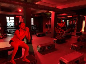
Apart from visual appeal, colours can impact our hormonal surge, especially the ‘excitement hormone’ Dopamine! The hypothalamus also gets impacted with colours via signals from retinal ganglion cells. The hypothalamus is responsible for the secretion of multiple hormones and also controls the body’s self regulation system such as sleep and stress. For example, a room painted with ‘flaming red’ will be perceived hotter and ‘physically stimulating’ than a room painted with White, Blue, Brown or Green! The LA-based HIIT studio, called Barry’s Bootcamp uses the intense red environments in their workout rooms so that these spaces can impact the users to sweat faster (during their fat-blasting-calorie-incinerating sessions) with a perception of ‘higher intensity workout’. Barry’s is one of the most popular workout spaces for celebrities like Kim Kardashian and Justin Bieber and they have branches across key cities of the world including Singapore and Dubai.

Barry’s Bootcamp Photo by Kjetil Ree

It is a well-known fact that colour preference is a psychological phenomenon which involves human perceptual reaction to colour and expressed emotions associated with those specific colours. However, the trichromatic human is extremely colour-biased and usually a homo-sapien sees what he/ she intends to see! The superpower of the human brain helps us to imagine beyond the image. The bias-ness is so evident that in one of my exploratory colour workshops, the whole group identified a Pink colour visual as ‘banana’ (art by Dalibro) even when bananas are usually Yellow, Green or Red (occasionally). The same was repeated for a Blue visual. The group even announced that the Blue visual is of a ‘fascinating Blue Orange’ with Red pulp! Though our past experience of a Banana and Orange (in the conventional colourway) never had such colours, our biassed mind forced us to believe that Bananas can be Pink and Oranges can even be Blue.


Pink Banana Photo by Cody Davis
Blue Orange Photo by Cody Davis

The ‘Pink Banana and Blue Orange experiment’ proves that colour biases can impact products and their perception.

For both visuals, participants initially extracted borders between objects and their backgrounds and then “filled in” colours. The edges confirmed that the shape/ form appeared to be of a Banana and an Orange, though, after filling in the colours (Pink and Blue) the colour perception indicated otherwise. In the second phase of this experiment, I went ahead and asked the participants whether they would be interested in ‘eating a Pink Banana or Blue Orange’, of which they were not very sure about its ‘taste’ and goodness. One mentioned that the Blue Orange appears ‘unreal’ and ‘poisoned’ hence she may not try it. The Pink Banana was still ‘acceptable’ as ‘food’. Thus, though the brain declared them to be bananas and oranges, experience cautioned the body against the consumption of the same.

The ‘Pink Banana and Blue Orange experiment’ proves that colour biases can impact products and their perception. For example, a less colourful space (‘Gray/White space’) is presumed to be more ‘urban’ and expensive in India rather than a colourful space. There has been an ongoing discussion on whether we are becoming more colourless in our space/ product preference/ design. I believe that in urban India we emphasise one’s social status because in India colour is in abundance and colourlessness can prove that the person is in a higher social hierarchy because maintaining grey/white space in India is pretty difficult with our tropical climate.

The Iceberg Theory: A Model to Map Color Experience

Though the impact of certain colours (i.e. Red or Black) is universal, the excitement and rush through colours is subconscious and cannot be explained unless one digs deeper into the viewer’s personal mental space to map ‘conscious/ subconscious experiences’ which can be ‘earned or presumed’. I always stress the fact that colours can impact us in two different layers/ spaces. One in our ‘personal space’ and the other in the context of ‘social space’. The colour expression of a viewer/ user can be mapped through the Iceberg theory. The theory emphasises that our colour expression is a reaction to our layered colour memories. The colour memories are like eternal tags associated with a colour from the colour experience  one  can  gain  during the entire life). These colour experiences are of three types: the childhood/ teenhood experiences (the strongest association), the learned experience (through social interaction in personal life) and  induced  experience  (that one has not experienced but ‘heard of’). A very good example of inducted experience is the colour black. In India, the colour black is marked as an ‘unauspicious’ colour on most of the occasions. The above theory can be used to understand the  customer’s  experience with  specific  colours  and the colour decisions that can be taken accordingly. I always stress that the “right colour-stories can fetch you better results”. Explore  and  understand the realm of colours!

 Colours, Spaces and Stories

"Narrate it with colour and navigate with Nippon paint"

A colour never stands isolated. Colours in India have always stood with their stories (mythologies, beliefs, folklore and personal accounts), context, emotions and social values. Hence, to develop a design with the right colour impact one must design the most suited ‘colour story’ that touches not only 'social space' but also one’s 'personal space'. Colours are closely associated with culture, geography, and people and hence we must shape our spaces accordingly. In a culturally diversified and plural country like India, colour has always been a crucial element in our religious, social and cultural identity. The correct colour stories can fetch you better results. Colour experiences, colour biases, and mapping colour-bio-behaviour can impact businesses positively. Designers can now involve Nippon Paint colour experts in deep research to navigate their colourways and colour stories for any design.

About the Author

Dr. Kaustav Sengputa
Colour Psychologist

Dr Kaustav Sengupta holds a PhD in Colour Psychology and is a renowned academician, futurist, trend analyst, colour bio-behaviourist, colour forecaster, writer, social worker, TEDx speaker and Associate Professor at the National Institute of Fashion Technology, Chennai.

​Multiple insights models, hypotheses and theories are under his credit including the Colour Image Emotion Association model for India. He is the Lead Colour Forecaster of ColourVision- Nippon Paint India Pvt. Ltd, Director Insights – VisioNxt Trend and Fashion Forecasting AI Lab)

OPEN FOR
SUBMISSIONS
linkedin facebook pinterest youtube rss twitter instagram facebook-blank rss-blank linkedin-blank pinterest youtube twitter instagram